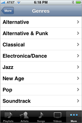
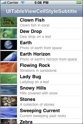
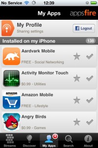
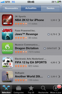
Appsfire as a project started over 24 months ago. At the time, iOS was already fairly developed, but User Interfaces rarely erred outside of the recommended guidelines (also by fear of not being approved), except for games where everything goes. Apple had polished and optimized the vertical scrollable view (UITableView for our Cocoa readers), and effectively entrenched this browsing mode as the golden standard for long lists of objects, which remains, to this date, a perfect way to browse lists of strings, augmented with the occasional icon and corollary information.
This UI/UX element was fine for us back then. After all, the initial version of the Appsfire app for iOS (up to v2.0) just needed to present its users with a long list of applications to share or browse, all of which had a title name, an icon, and a category. In fact, this is also how the iTunes App Store presented its content, and still does today.
But then, three things happened.
1/ Appsfire v2.0 sat in the approval process no-man’s land for 3 months.
2/ The iPad came out…
3/ and at the same time, we realized that app developers invested a lot in design and almost as importantly, app icons.
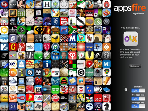
The first issue was unsettling, we’ve covered this episode before here. However, we couldn’t stand sitting idle, so I took the app, and sliced and diced it into several apps that I though “might” get approved by Apple (vs. Appsfire v2.0 which obviously was posing a problem). One of these sub-apps, developed over the course of a single week-end, was showing an animated spiral of app icons, nothing more and in no particular order as if randomly chosen, allowing to zoom in with a simple tap. We called this app “Appstream” and pusblished it for the iPad only, which has a screen that is naturally better at displaying a spiral of icons than a list of strings! “Surely Apple couldn’t refuse it,” we thought, actually believing that we were doomed and Apple would never approve any of our apps [paranoia mode at the time - we're fine now, thank you].
And so, we submitted Appstream, which was approved very quickly, and became an instant hit, also being featured on iTunes App Store on iPad, at the first position. Appstream was downloaded by approximatively 10% of all iPad owners during the summer of 2010. This innovative app-roach probably participated in unlocking the Appsfire v2.0 situation; Appstream was our Black Swan! (or at least that’s what we think happened, we’ll never know for sure, will we?!)
Perhaps more importantly, we realized how much information and detail went into the app icons: indeed, icon design often represents a significant fraction of an app development budget. Rightly so, our reptilian brain is better suited to process images than text. Even the Apple app evangelist recommended strong icons, with sharp outlines, silhouettes and contrasty colors. What’s more: if you scroll down a long list of icons vertically, or swiping horizontally on your springboard to find one app out of 148 apps, or in Appstream with its 500+ icons displayed at once, what do you see? Impressions of shapes and colors, not text.
Exit Lists. Enters Streams.
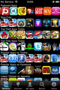
We gradually started introducing streams into both our iPhone apps - Appsfire v2+ and the more recent App Deals. Streams were layed out horizontally, one per “theme” or “category” and stacked on top of one another into a list object (the famed UITableView mentioned above - yes, it’s still a key component). Those streams allowed to present more apps, increasing the reptilian discovery, making it more fun, and allowing to pack a lot more into a smaller screen.
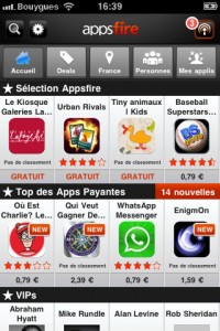
But then icons are not born equal, sadly so. And good apps with poor icons (hint: invest in design!!!) were being drowned by mediocre apps with splashy design. And so, we had to reintroduce metadata, like stars, and a title, and more if possible. The “app cell” had to grow larger to accomodate all that data, and yet remain tight so as to allow stream-stacking and horizontal swiping. This is how it looks like on Appsfire 3.0:
Other apps have also adopted this horizontal browsing UX, like the excellent Pulse or more recently the iTunes Movie Trailer.
We think this new layout and browsing experience is fantastic, versatile and pretty universal (as in iPhone/iPad Universal).
We will be evolving it from here, and adding twists and transitions too.
As for Appstream, we think we will retire it. It has done its time.
Instead we will bring you Appsfire 3.2 and Appfire Deal 2.1, universal, soon!
What do you think?
Meanwhile, grab these apps if you don’t have them yet!


