In theory the new iTunes 11 should not have a major impact for mobile app developers. Why? because the vast majority of downloads are not made from the computer but from the mobile. Right in the App store App. But developers can’t ignore the changes that just took place in iTunes 11. Why? because iTunes on the computer is still generating massive traffic and a lot of the discovery is made on the computer (take for example the impact of blogs when you launch a new app on Rankings). It is also still used massively by mobile app developers and other professionals as they work.
So how good are those changes for Mobile app developers?
Well at first iTunes 11 seems cleaner in the design, but the key structure of the app store is not changing a bit. The important sections driving traffic are still exactly the same (new and noteworthy and top ranks) and places nearly at the same place
At first launching iTunes 11, it was quite hard to figure out where the App store was. It is in fact at the exact same place, except that now you will have to browse from your “Library” section to “iTunes Store” section [when will they call it iStore?] and it is not an obvious thing to notice because the button is in the same colour of the background (white). There was no “binary” mode before and users will have to get used to it.
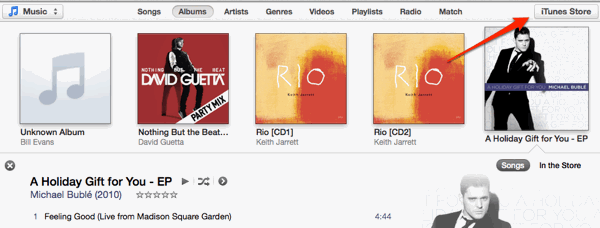
Once you are in the “App Store” section it pretty much feels the same except the omni presence of the white make it hard to distinguish the limits between the top ranks and editorial listings
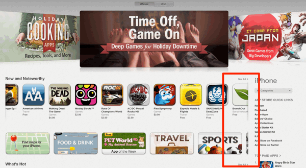
The App store in itself is pretty similar to what you must have seen in iOS6 on the iPad. Now one thing that has been removed, probably because not used a lot, is the little (i) present on each app icon which was giving a preview of the description and screenshot before you click on the icon and go to the detailed view
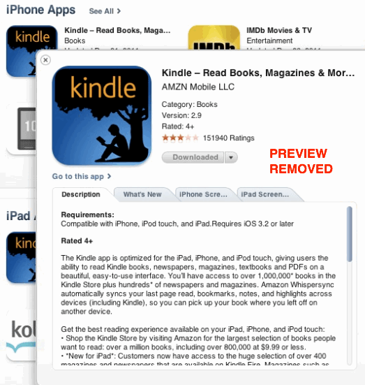
This means that now you are forced to clicks back and forth on icon or another to view what it is you’re about to download
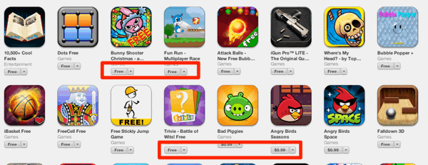
There seems to be a lot of visual glitches in and lack of attention to details in the structure of the new App store. For example when you browse the top ranks, the FREE tag (which is now very small) does not appear aligned consistently. The top 200 does not end up at the line if you are resizing the App store.
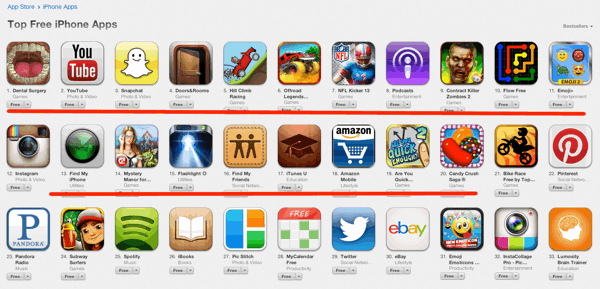
Search results pages present the same presentation problem, and because FREE and PAID labels are the same colour it is nearly impossible to spot the FREE apps faster.
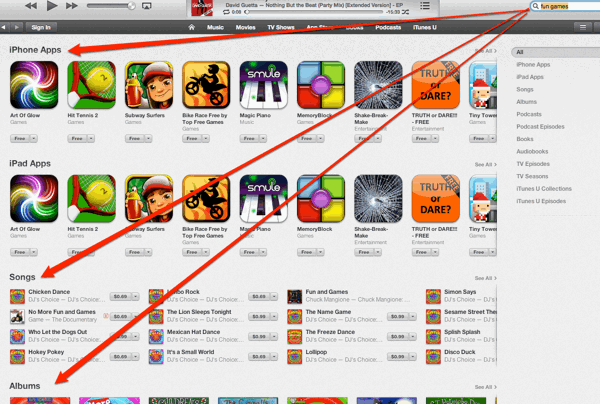
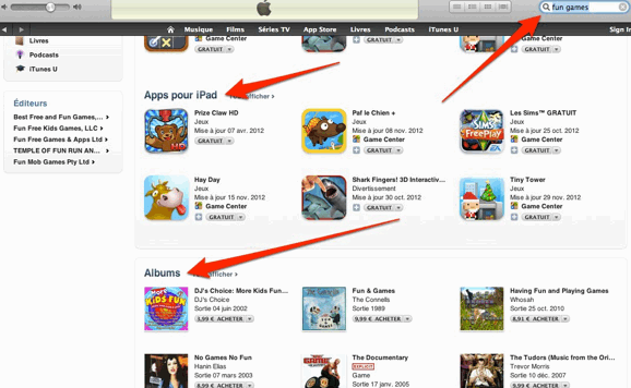
Now there is something confusing regarding search experience: When you are in the App Store section and perform a search iTunes will show you results of every single category of the store, as before, but the proportion of Apps vs Songs and Albums seem to have been reduced (only 1 line of apps vs 2 lines before in iTunes 10) . It’s a strange choice which will certainly confuse.
That is the search experience BEFORE in iTunes 10
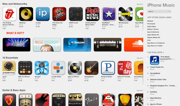
Each Category has now the equivalent of its “home page” with the same layout as the App store home page (new and noteworthy, staff selection,…). But the What’s Hot section (mostly based trends of activity) has disappeared, except the GAMES section.
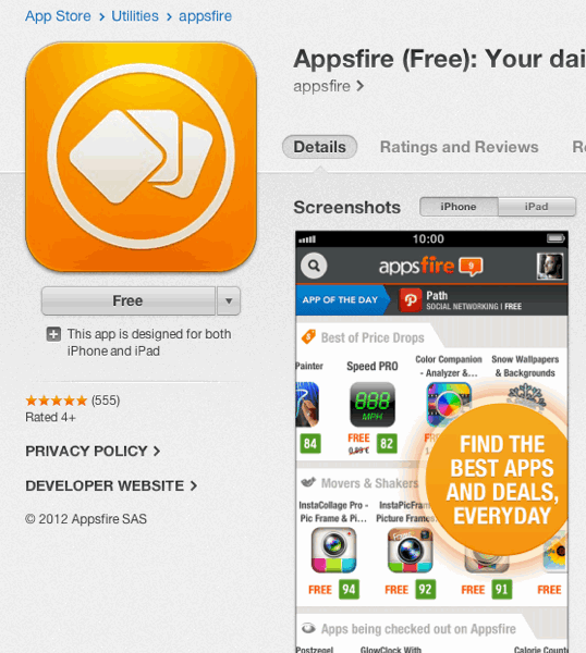
Another big change is the way Apps page are laid out and which is logically similar to the App store lay out in iOS 6. The description comes below the screenshot. And more than ever the screenshot (specially the first one) will matter a lot
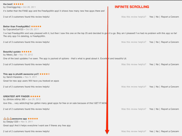
One of the most important changes come from the REVIEW section. Curiously there is no integration of Facebook likes here. But unlike iOS6 and iTunes 10, there is no more need to scroll through pages of reviews thanks to an infinite scrolling option. You now easily browse all the reviews without having to clicks on the page tabulation that used to be there..But this also means that Reviews are now accessible in a separate section 1 click away and not right below the screenshots.
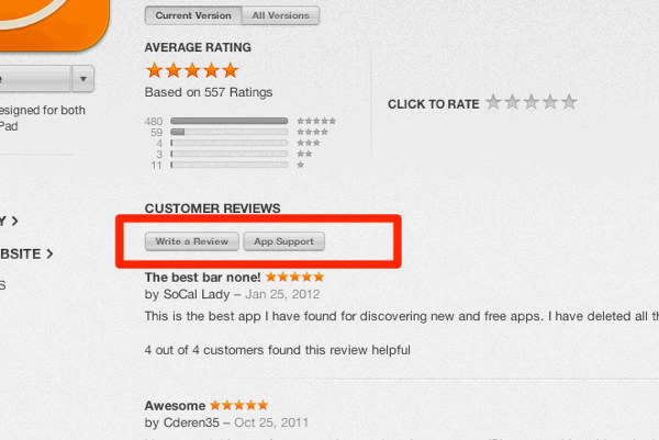
The menu buttons to write a review are also hardly visible and readable. Why on earth have they made it that way?
Overall
It is indeed a cleaner presentation than before, but users will have to double their efforts to find Free apps, Access full search results. The App store section presents also many visual inconsistencies that could easily be fixed and a weird first step search experience.
We don’t expect to see tremendous changes as far as app discovery is concerned. Search is still pretty much the same - for good and for bad - Critical editorial sections are merchandised very similarly and speed does not seem a lot better than before.
The experience is more consistent with iOS6 but it seems more than the App store on iTunes was adapted to the Mac after it was redesigned first for the iPhone and iPad rather than the opposite. It does not feel like a computer first product
Bonus question: When will the Mac App store be updated with the same design?


