Mailbox is quite unique in the App landscape. They managed to get massive traction (top 5 in many countries including USA) in the App store without have a product that is actually available to most users (and obviously without spending a dime in marketing)
Mailbox is promising to revolutionise the way we’ll use email (Gmail for now) on our mobile phones (iPhone for now). So they have done a set of great things beginning with apparently an awesome product that only a few users are able to use for now and have added a reservation system to progressively let others in.
This was massively amplified by bloggers who are all saying this is a great product but did not care too look at the collateral damages of this invite system.
It is very clear this reservation has some deep technical reason to handle the scale. But we’re seeing here more of a smart marketing technique to create desire and interest. And we think they did not handle it right. Here is why.
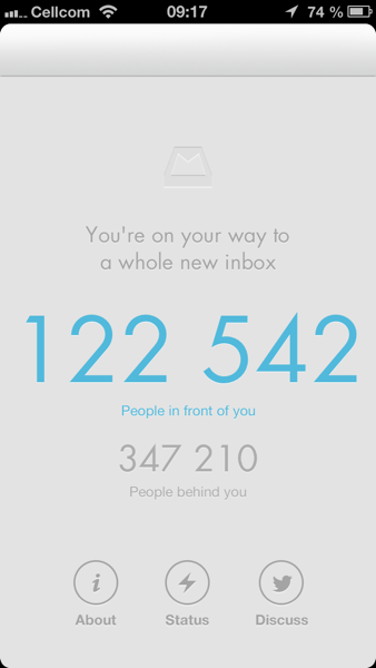
The problem is the following: there is right now a lot more people waiting than people using the app [below what i see on my screenshot and i was very early on in the reservation system]. So why did Mailbox launched now?

They knew what the level of demand was before the pressed the green light button to release the app. They knew they would generate a lot of frustrations from users
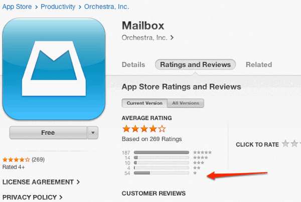
And this translated in a massive proportion of 1 star reviews (20% of all reviews, 30% of the 5 star apparently attributed by those who were let in). Why so much frustration?

- Well the reservation - prior to the app launch - they put in place was already promising you to let you in on a first arrived first served basis. But the reality is that most user who jumped in realised that although they received a code to get in - they were still tens of thousands of users away to get in. So in other words it is a reservation system that was not really reserving anything
- The new users who downloaded the app because they saw it top rank, did not even get a sense of what the app actually does and gave a poor rating
- The queueing system does not give a sense of timing: how long will i wait to get in
How could have they handled it better?
1. From the get go give a full preview of Mailbox on a dummy account. There is no scale or tech issues here. Just let people taste the product
2. include in the app a video preview of what the app does
3. include a feedback system in the app to make sure negative comments and frustrations go to them directly and not through the app store
4. Include in their app first screenshot the fact the app is not available yet and that there is a queueing system. They have a little sentence in the description: no one bothers to read description specially when you re showing up in the top 25.
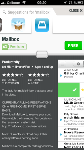
That’s why although the app is being top ranked in many countries right now, the App score (our quality score) is only 63 (promising). Now let’s see how they handle their next steps.

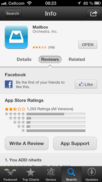
update 24h later: it’s getting worse. Screenshot below is US only and it’s even worse in countries like France…And Mailbox App Score dropped to 38


